CSS property scrollbar-gutter helps working with vertical scrollbar much easier. We can now have a pure CSS solution rather than having to fiddle around with JavaScript — which can be very painful! I have just solved a problem I had with vertical scrollbar using this property, I am discussing my implementation with a complete working demo HTML page.
Let’s first briefly discuss what we want to achieve. I am using
Bootstrap v5.0
grid layout in my HTML pages. I have a long dynamic data list sitting in a div,
and so this div must have a vertical scrollbar, users can select a row at a time from this list
to move to a second list. They can also remove a row from this second list, and the just removed
row will be moved back to the first list.
As the second list grows, the vertical scrollbar will eventually appear. And on the
first list, the vertical scrollbar could disappear. It goes without saying, if enough
rows get removed from the second list, the vertical scrollbar would disappear also.
The above behaviour happens naturally, all we have to do is setting the height and
vertical scrolling on the two divs.
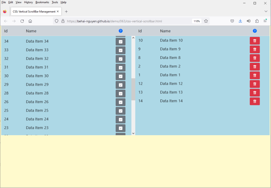
The two lists also have a header or a label row, each. And this’s where the
issue is: I want the scrollbar to always sit under the header row, and
the data columns must always align with the respective header columns — both
when the list has the vertical scrollbar and without. The below
screen capture, from the demo page, shows this behaviour:
Originally, I had JavaScript to recalculate the columns’ width
in response to when a vertical scrollbar appears and disappears — I had around
45 (forty five) lines of JavaScript, and still, I could not get
it to work correctly at all times. After some searching, I came to this
scrollbar-gutterCSS property.
It is so beautiful, and easy to use… Please run the following demo to see this
CSS property in action:
This feels strange, since the header rows do not have a scrollbar. There is a
reason for it. The documentation
scrollbar-gutter
states:
The scrollbar-gutter CSS property allows authors to reserve space for the scrollbar, preventing unwanted layout changes as the content grows while also avoiding unnecessary visuals when scrolling isn’t needed.
An element’s scrollbar gutter is the space between the inner border edge and the outer padding edge, where the browser may display a scrollbar. If no scrollbar is present, the gutter will be painted as an extension of the padding.
So, basically, I am just “reserving” vertical scrollbar space on the header rows,
so that header columns are pushed to the left by the same amount as the data
columns — making them always aligned.
The div containers for the two lists should be self-explanatory:
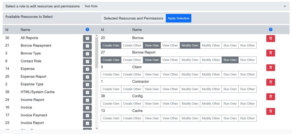
This demo page is actually a simplified version of pages from a project I have been working.
An example of a page:
I do realise that
Bootstrap v5.0
handles vertical scrollbar quite well, if we accept the default behaviour: the scrollbar
actually comes up beside the header row. I do not like this look, this is the only reason
why I went through all this trouble. It feels satisfying nailing this issue at last though 😂.
I hope you find this information useful. Thank you for reading. And stay safe as always.
In this post, we discuss how to use Bootstrap 5.0 icon CSS with Bootstrap CSS to create buttons with icon and text, and buttons with icon and no text.
Bootstrap provides free, high quality, open source icon library with over 1,600 icons.
Please see https://icons.getbootstrap.com/, this page
lists available icons and their names. We’ll use these icon names to display the actual
icons.
Toward the bottom of the page, under the Install section, we’ll find
the download button and
CDN link to
bootstrap-icons.css.
These two font files are part of the download. I believe we can include
them in our own applications — but please do your own investigations before you
redistribute them.
I did enjoy looking at how to do this… these two
Bootstrap CSS libraries work together seamlessly. Thank you
for reading, and I hope you find this post useful. Stay safe as always.
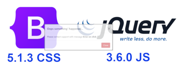
Constructing a generic on demand Bootstrap 5.1.3 popup modal dialog as a JavaScript closure.
We do some
AJAX requests, they result in errors, and we need to display
those error messages to users. In previous projects, we use dynamic
jQuery dialogs to do this. I’ve now re-created similar dialog
using
Bootstrap 5.1.3; and
jQuery 3.6.0 script library. For official information on
Bootstrap modal dialog, please take a look at this page:
https://getbootstrap.com/docs/5.0/components/modal/;
please pay attention to the event section:
https://getbootstrap.com/docs/5.0/components/modal/#getorcreateinstance.
The following screen captures show the dialogs in action. They are
standard
Bootstrap 5.1.3 modal dialog. I’ve not done any customisations,
nor new
CSS. The dialog
HTML comes from
https://getbootstrap.com/docs/5.0/components/modal/:
I’ve implemented the on demand dialog as a
JavaScript closure. This is a ready to use
JavaScript code:
File popupdialog.js
/*
Description:
A generic dynamic Bootstrap 5.0 popup dialog.
The dialog HTML is created dynamically and gets removed
after finished closing.
Arguments:
title:
Dialog title.
message:
Actual message text to be displayed inside dialog body.
This is HTML: text must be wrapped inside a HTML tag, e.g.:
<span>Please contact <strong>Support</strong>...</span>
buttonClass:
Bootstrap CSS class names, such as 'btn-danger', 'btn-warning'.
Default is 'btn-danger'.
*/
function genericDialog( title, message, buttonClass='') {
var dialogHTML =
'<div class="modal fade" id="popupDialog" tabindex="-1" aria-labelledby="popupDialogLabel" aria-hidden="true">' +
'<div class="modal-dialog modal-dialog-centered">' +
'<div class="modal-content">' +
'<div class="modal-header">' +
'<h5 class="modal-title" id="popupDialogLabel">Title</h5>' +
'<button type="button" class="btn-close" data-bs-dismiss="modal" aria-label="Close"></button>' +
'</div>' +
'<div class="modal-body">' +
'This is a test modal.' +
'</div>' +
'<div class="modal-footer">' +
'<button type="button" class="btn btn-danger" data-bs-dismiss="modal">Close</button>' +
'</div>' +
'</div>' +
'</div>' +
'</div>';
function initialise() {
// Should not exist, but just in case.
$( '#popupDialog' ).remove();
$( 'body' ).append( $(dialogHTML) );
var dialog = $( '#popupDialog' );
$( '.modal-title', dialog ).text( title );
$( '.modal-body', dialog ).empty().html( $(message) );
if ( buttonClass.length > 0 )
$( 'button', dialog ).removeClass().addClass( 'btn ' + buttonClass );
// Fired when dialog is completely hidden. Remove dialog from the DOM.
dialog.on( 'hidden.bs.modal', ( event ) => $( '#popupDialog' ).remove() );
};
function doOpen() {
var modal = new bootstrap.Modal( '#popupDialog' );
modal.show();
};
function open() {
initialise();
doOpen();
};
return open;
};
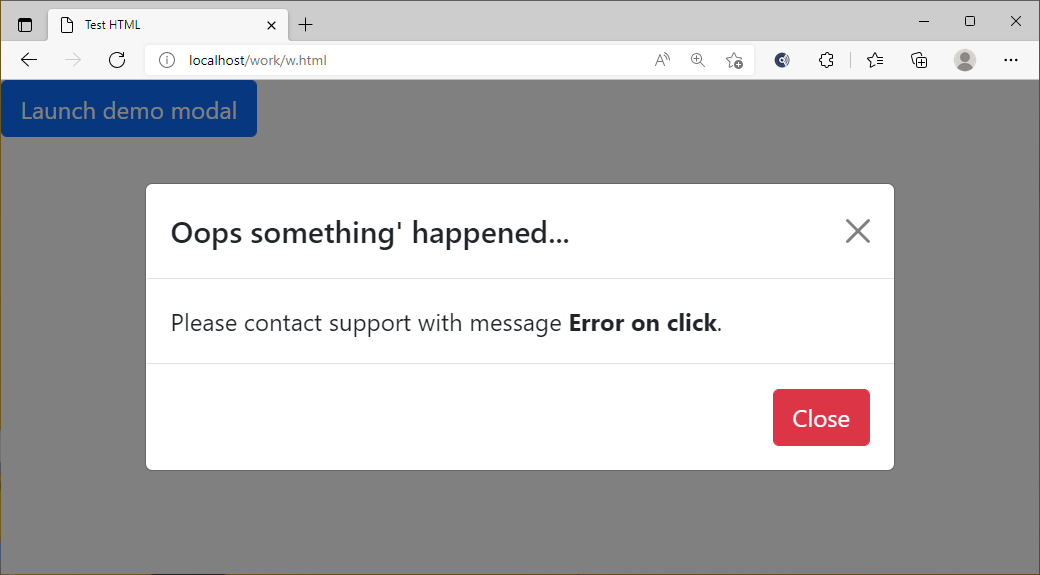
function displayError( xhr, error, errorThrown ) {
var html = `<span>Please contact support with message <strong>${errorThrown}</strong>.</span>`;
genericDialog( 'Oops something\' happened...', html )();
};
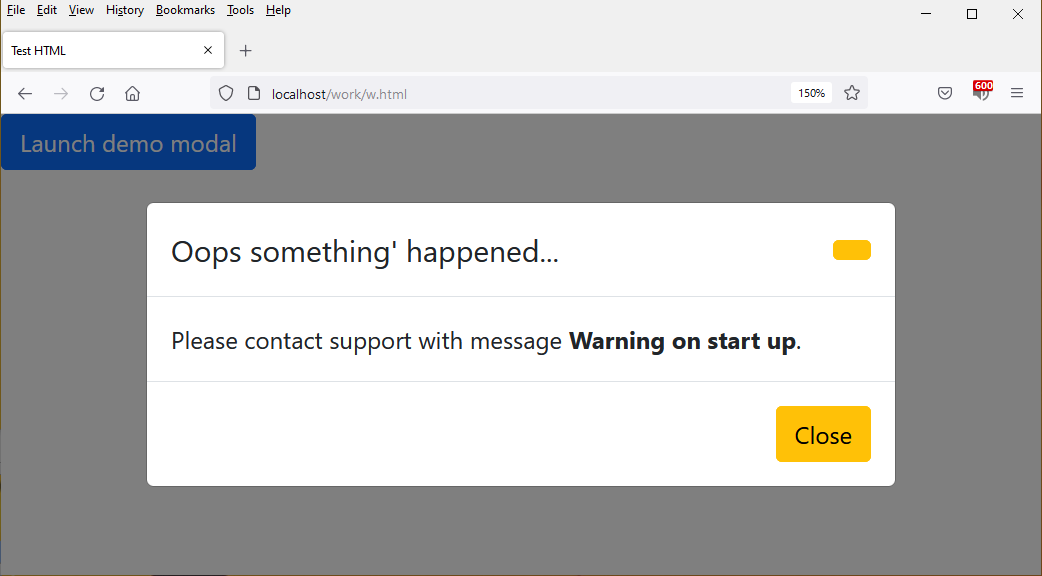
function displayWarning( xhr, error, errorThrown ) {
var html = `<span>Please contact support with message <strong>${errorThrown}</strong>.</span>`;
genericDialog( 'Oops something\' happened...', html, 'btn-warning' )();
};
function displayInfo( msg ) {
var html = `<span>msg</span>`;
genericDialog( 'For your info', html, 'btn-info' )();
};
The code is very simple. Please note that, every time the
closure is called, the actual
HTML for the dialog is created in the
DOM, when the dialog’s finished closing, its
HTML gets removed from the
DOM. Following is the
HTML test page:
The call to
displayWarning( … ) demonstrates the dialog main usage:
popup on demand.
Please also note that, I don’t call
the
closure directly, but rather the methods that use it..
This is my first cut of the dialog. I’m sure it’s going to change in the
future. The content of the dialog can be made as rich as
Bootstrap 5.1.3 would allow: and this can be done outside of the
closure.
I hope you find this a tiny bit useful. And thank you for visiting. Stay
safe and take care.
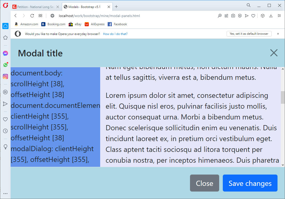
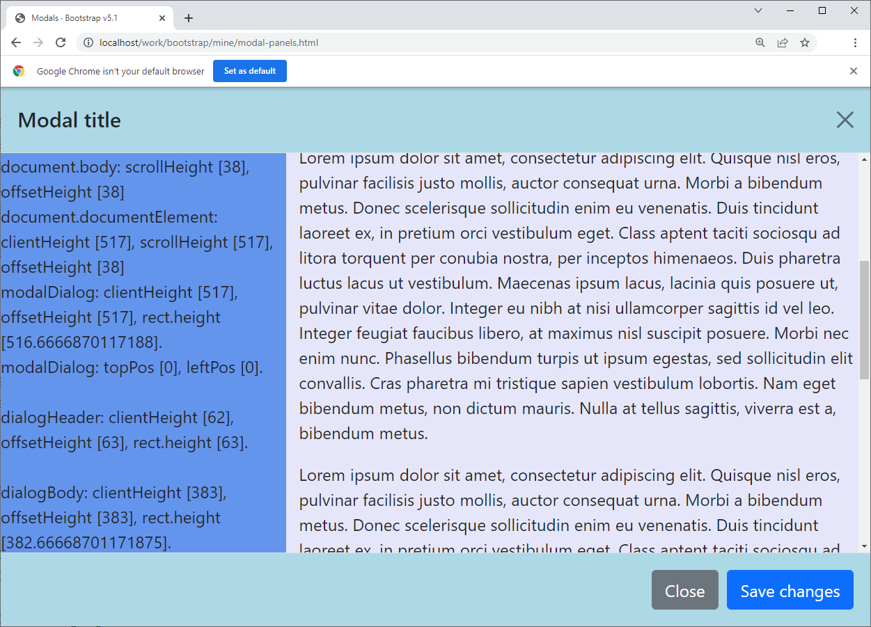
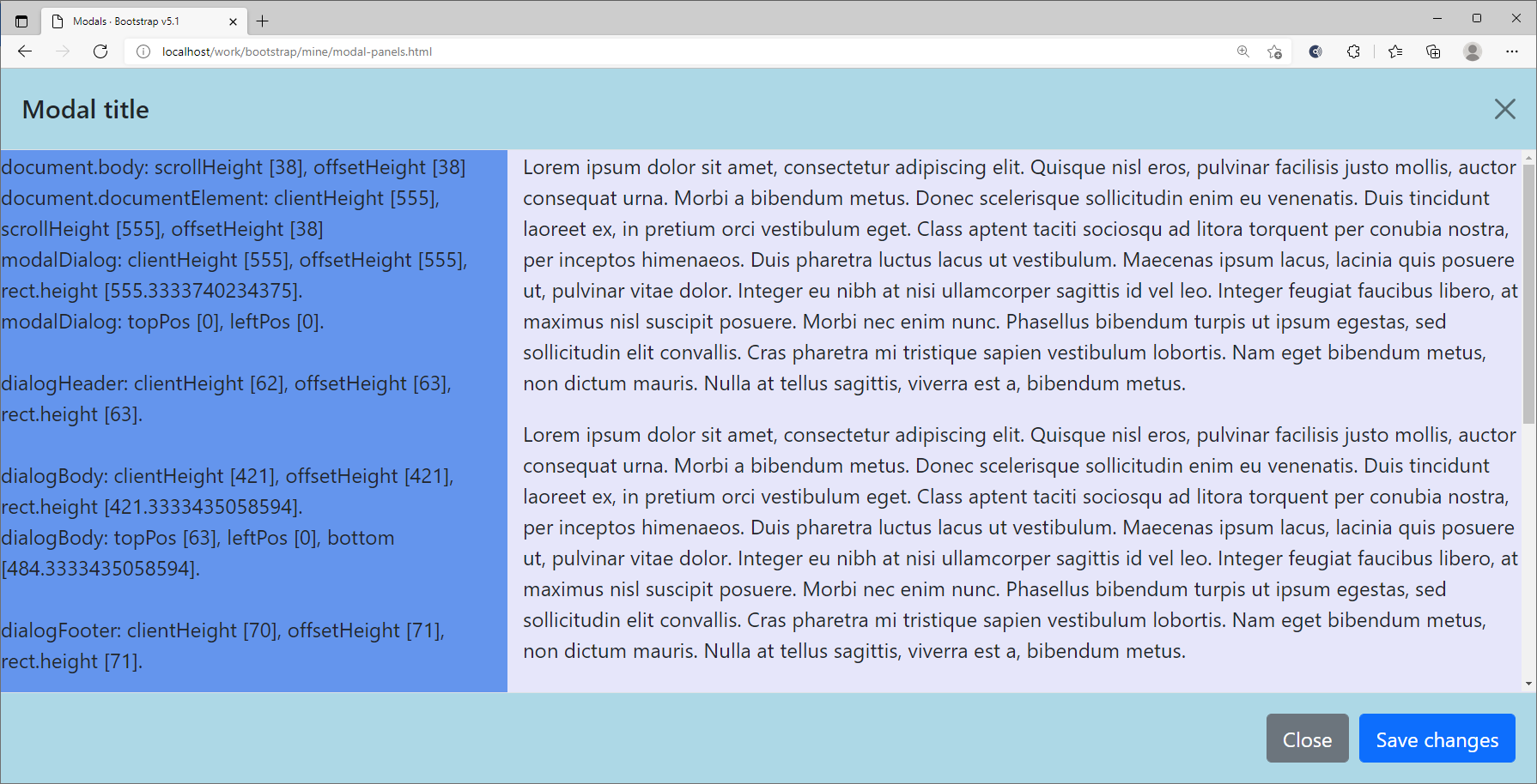
Constructing a Bootstrap 5.1.3 responsive full screen modal dialog whose body contains a non-scrollable left panel, and a vertically scrollable right panel.
I need a modal dialog with a header, a footer, a fixed content pane on
the left and a scrollable content pane on the right. I choose to use
the full screen modal dialog from
Bootstrap 5.1.3; and
jQuery 3.6.0 script library to manage its internal working.
The structure of the full screen dialog in this article is from
https://getbootstrap.com/docs/5.0/components/modal/;
I add my panels inside the dialog body — as how it’s supposed to be.
In real usage, the panel on the left holds input UI elements,
the panel on the right holds dynamic results. This layout is
not particularly hard to do… But I did have problems with the
vertical scroll bar on the right panel: I could not get it
to behave correctly using
CSS —
to scroll vertically, the DOM needs to know the
height of the element, and I could not work it out via
CSS. So I resort to using
JavaScript to set the height dynamically when:
The dialog becomes fully visible.
Browsers are resized ( we can’t resize the dialog itself ).
The
height of the panel is the value of the
clientHeight of the dialog body. The full code listed below.
You can copy this HTML out,
it will run as is on your localhost.
<!doctype html>
<html lang="en">
<head>
<meta charset="utf-8">
<meta name="viewport" content="width=device-width, initial-scale=1">
<meta name="description" content="">
<title>Modals · Bootstrap v5.1</title>
<!-- CSS only -->
<link href="https://cdn.jsdelivr.net/npm/bootstrap@5.1.3/dist/css/bootstrap.min.css" rel="stylesheet" integrity="sha384-1BmE4kWBq78iYhFldvKuhfTAU6auU8tT94WrHftjDbrCEXSU1oBoqyl2QvZ6jIW3" crossorigin="anonymous">
<style>
/* Modified CSS. */
.modal-body { padding: 0; }
.modal-header, .modal-footer { background-color:lightblue; }
/* New custom CSS. */
.vertical-scrollable {
overflow-y: auto;
overflow-x: hidden;
}
</style>
<script src="https://cdn.jsdelivr.net/npm/bootstrap@5.1.3/dist/js/bootstrap.bundle.min.js" integrity="sha384-ka7Sk0Gln4gmtz2MlQnikT1wXgYsOg+OMhuP+IlRH9sENBO0LRn5q+8nbTov4+1p" crossorigin="anonymous"></script>
<script src="https://code.jquery.com/jquery-3.6.0.min.js" integrity="sha256-/xUj+3OJU5yExlq6GSYGSHk7tPXikynS7ogEvDej/m4=" crossorigin="anonymous"></script>
<script>
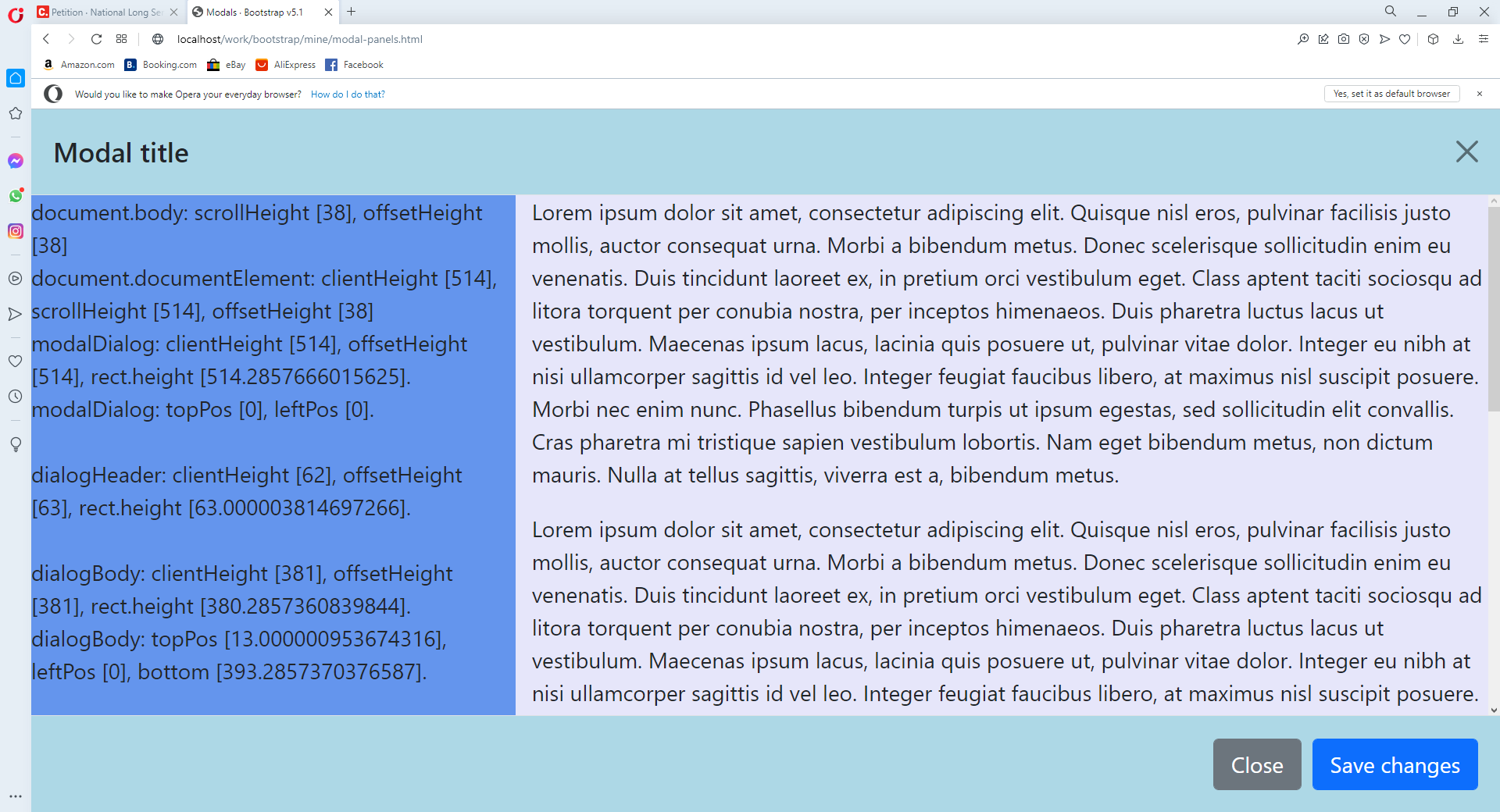
function testHeight() {
var body = document.body;
var str = `document.body: scrollHeight [${body.scrollHeight}], offsetHeight [${body.offsetHeight}]<br/>`;
var html = document.documentElement;
str = str + `document.documentElement: clientHeight [${html.clientHeight}], scrollHeight [${html.scrollHeight}], offsetHeight [${html.offsetHeight}]<br/>`;
var clientHeight = document.getElementById('modalDialog').clientHeight;
var offsetHeight = document.getElementById('modalDialog').offsetHeight;
var elem = document.querySelector( '#modalDialog' );
var rect = elem.getBoundingClientRect();
str = str + `modalDialog: clientHeight [${clientHeight}], offsetHeight [${offsetHeight}], rect.height [${rect.height}].<br/>`;
var topPos = rect.top + window.scrollY;
var leftPos = rect.left + window.scrollX;
str = str + `modalDialog: topPos [${topPos}], leftPos [${leftPos}].<br/><br/>`;
var clientHeight = document.getElementById('dialogHeader').clientHeight;
var offsetHeight = document.getElementById('dialogHeader').offsetHeight;
var elem = document.querySelector( '#dialogHeader' );
var rect = elem.getBoundingClientRect();
str = str + `dialogHeader: clientHeight [${clientHeight}], offsetHeight [${offsetHeight}], rect.height [${rect.height}].<br/><br/>`;
var clientHeight = document.getElementById('dialogBody').clientHeight;
var offsetHeight = document.getElementById('dialogBody').offsetHeight;
var elem = document.querySelector( '#dialogBody' );
var rect = elem.getBoundingClientRect();
str = str + `dialogBody: clientHeight [${clientHeight}], offsetHeight [${offsetHeight}], rect.height [${rect.height}].<br/>`;
var topPos = rect.top; // + window.scrollY;
var leftPos = rect.left; // + window.scrollX;
str = str + `dialogBody: topPos [${topPos}], leftPos [${leftPos}], bottom [${rect.bottom}].<br/><br/>`;
var clientHeight = document.getElementById('dialogFooter').clientHeight;
var offsetHeight = document.getElementById('dialogFooter').offsetHeight;
var elem = document.querySelector( '#dialogFooter' );
var rect = elem.getBoundingClientRect();
str = str + `dialogFooter: clientHeight [${clientHeight}], offsetHeight [${offsetHeight}], rect.height [${rect.height}].<br/>`;
str = '<p>' + str + '</p>';
$( '#inputArea' ).empty().html( $(str) );
};
function setWorkingAreaHeight() {
var height = document.getElementById('dialogBody').clientHeight;
$( '#outputArea' ).css( 'height', height + 'px' );
};
$( document ).ready( () => {
$( '#modalBtn' ).on( 'click', ( event ) => {
var modal = new bootstrap.Modal( '#modalDialog' )
modal.show();
$('#modalDialog').on( 'shown.bs.modal', ( event ) => {
testHeight();
setWorkingAreaHeight();
});
$( window ).resize( () => {
testHeight();
setWorkingAreaHeight();
});
});
});
</script>
</head>
<body>
<button type="button" id="modalBtn" class="btn btn-primary">
Open Dialog
</button>
<div class="modal fade" id="modalDialog" tabindex="-1" aria-labelledby="exampleModalLabel" aria-hidden="true">
<div class="modal-dialog modal-fullscreen">
<div class="modal-content">
<div class="modal-header" id="dialogHeader">
<h5 class="modal-title" id="exampleModalLabel">Modal title</h5>
<button type="button" class="btn-close" data-bs-dismiss="modal" aria-label="Close"></button>
</div>
<div class="modal-body overflow-hidden" id="dialogBody">
<div class="row">
<div class="col-4" id="inputArea" style="background-color:lemonchiffon;">
</div>
<div class="col" style="background-color:lavender;">
<div id="outputArea" class="vertical-scrollable">
<p>
Lorem ipsum dolor sit amet, consectetur adipiscing elit. Quisque nisl eros, pulvinar facilisis justo mollis, auctor consequat urna. Morbi a bibendum metus. Donec scelerisque sollicitudin enim eu venenatis. Duis tincidunt laoreet ex, in pretium orci vestibulum eget. Class aptent taciti sociosqu ad litora torquent per conubia nostra, per inceptos himenaeos. Duis pharetra luctus lacus ut vestibulum. Maecenas ipsum lacus, lacinia quis posuere ut, pulvinar vitae dolor. Integer eu nibh at nisi ullamcorper sagittis id vel leo. Integer feugiat faucibus libero, at maximus nisl suscipit posuere. Morbi nec enim nunc. Phasellus bibendum turpis ut ipsum egestas, sed sollicitudin elit convallis. Cras pharetra mi tristique sapien vestibulum lobortis. Nam eget bibendum metus, non dictum mauris. Nulla at tellus sagittis, viverra est a, bibendum metus.
</p>
</div>
</div>
</div>
</div>
<div class="modal-footer" id="dialogFooter">
<button type="button" class="btn btn-secondary" data-bs-dismiss="modal">Close</button>
<button type="button" class="btn btn-primary">Save changes</button>
</div>
</div>
</div>
</div>
</body>
</html>
Please ignore
function testHeight() — it is just a debugging method.
function setWorkingAreaHeight() is responsible for dynamically
setting the
height of the right pannel; and these are the two event handlers
that call it:
For
HTML, I want the left panel not to scroll at all, and the
right panel to scroll vertically. So I turn off vertical scrolling
on the dialog body using
overflow-hidden:
I am taking charge of opening the dialog because I have to
build to some dynamic UIs for the dialog, as well as binding
event handlers for the UIs. The screen capture below shows
this dialog in a work in progress application: clicking on the
Search button on the left panel submits an
AJAX request to the server via
jQuery; the server then queries a
MySQL database, and returns results in
HTML.
I hope you find this article useful in some way. And thank you for
visiting. Stay safe and happy
Bootstrapping 😆😆
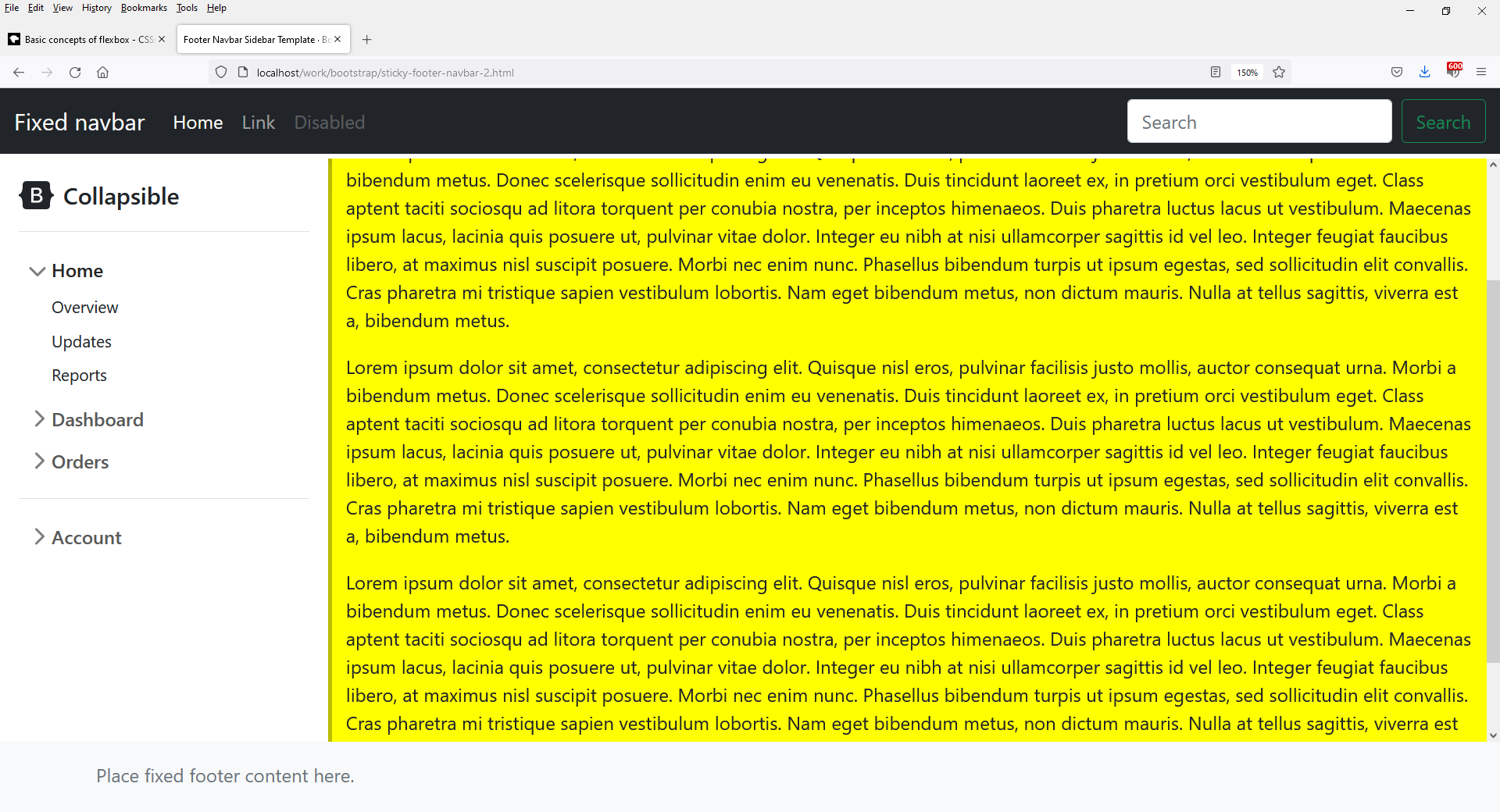
A Bootstrap 5.0 layout with a fixed header bar; a fixed footer bar; a sidebar on the left: below the header and above the footer; and finally a vertically scrollable working area on the right of the sidebar.
I want to have a layout with a fixed header bar; a fixed footer bar;
a sidebar on the left: below the header and above the footer; and
finally a vertically scrollable working area on the right of the
sidebar.
While this is not hard to do from the scratch using
CSS; I want to learn
Bootstrap further. The last version of
Bootstrap I looked at was
4.3.1, and now it is
5.1.3.
This is only the initial working version, so the codes are messy.
I do apologise. I thought I would just post this, otherwise
I will lose motivation later on. The
HTML and
CSS are posted below:
<!doctype html>
<html lang="en" class="h-100">
<head>
    <meta charset="utf-8">
    <meta name="viewport" content="width=device-width, initial-scale=1">
    <meta name="description" content="">
    <meta name="author" content="Mark Otto, Jacob Thornton, and Bootstrap contributors">
    <meta name="generator" content="Hugo 0.88.1">
    <title>Fixed Navbar Sidebar and Fixed Footer · Bootstrap v5.1</title>

    <!-- Bootstrap core CSS -->
    <link href="bootstrap-5.1.3-examples/assets/dist/css/bootstrap.min.css" rel="stylesheet">

    <style>
		.bd-placeholder-img {
			font-size: 1.125rem;
			text-anchor: middle;
			-webkit-user-select: none;
			-moz-user-select: none;
			user-select: none;
		}

		@media (min-width: 768px) {
			.bd-placeholder-img-lg {
				font-size: 3.5rem;
			}
		}
    </style>

    <!-- Custom styles for this template -->
    <link href="sidebars.css" rel="stylesheet">

	<style>
        header, footer {
			min-height: 60px;
		}

		main div.container {
			overflow-y: auto;
		}
	</style>
</head>

<body class="d-flex flex-column h-100">

	<svg xmlns="http://www.w3.org/2000/svg" style="display: none;">
		<symbol id="bootstrap" viewBox="0 0 118 94">
			<title>Bootstrap</title>
			<path fill-rule="evenodd" clip-rule="evenodd" d="M24.509 0c-6.733 0-11.715 5.893-11.492 12.284.214 6.14-.064 14.092-2.066 20.577C8.943 39.365 5.547 43.485 0 44.014v5.972c5.547.529 8.943 4.649 10.951 11.153 2.002 6.485 2.28 14.437 2.066 20.577C12.794 88.106 17.776 94 24.51 94H93.5c6.733 0 11.714-5.893 11.491-12.284-.214-6.14.064-14.092 2.066-20.577 2.009-6.504 5.396-10.624 10.943-11.153v-5.972c-5.547-.529-8.934-4.649-10.943-11.153-2.002-6.484-2.28-14.437-2.066-20.577C105.214 5.894 100.233 0 93.5 0H24.508zM80 57.863C80 66.663 73.436 72 62.543 72H44a2 2 0 01-2-2V24a2 2 0 012-2h18.437c9.083 0 15.044 4.92 15.044 12.474 0 5.302-4.01 10.049-9.119 10.88v.277C75.317 46.394 80 51.21 80 57.863zM60.521 28.34H49.948v14.934h8.905c6.884 0 10.68-2.772 10.68-7.727 0-4.643-3.264-7.207-9.012-7.207zM49.948 49.2v16.458H60.91c7.167 0 10.964-2.876 10.964-8.281 0-5.406-3.903-8.178-11.425-8.178H49.948z"></path>
		</symbol>
	</svg>

	<header>
		<nav class="navbar navbar-expand-md navbar-dark fixed-top bg-dark">
			<div class="container-fluid">
				<a class="navbar-brand" href="#">Fixed navbar</a>
				<button class="navbar-toggler" type="button" data-bs-toggle="collapse" data-bs-target="#navbarCollapse" aria-controls="navbarCollapse" aria-expanded="false" aria-label="Toggle navigation">
					<span class="navbar-toggler-icon"></span>
				</button>
				<div class="collapse navbar-collapse" id="navbarCollapse">
					<ul class="navbar-nav me-auto mb-2 mb-md-0">
						<li class="nav-item">
							<a class="nav-link active" aria-current="page" href="#">Home</a>
						</li>
						<li class="nav-item">
							<a class="nav-link" href="#">Link</a>
						</li>
						<li class="nav-item">
							<a class="nav-link disabled">Disabled</a>
						</li>
					</ul>

					<form class="d-flex">
						<input class="form-control me-2" type="search" placeholder="Search" aria-label="Search">
						<button class="btn btn-outline-success" type="submit">Search</button>
					</form>
				</div>
			</div>
		</nav>
	</header>

	<main style="background-color:yellow;">

	<!-- sidebar. --->
	<div class="flex-shrink-0 p-3 bg-white" style="width: 280px;">
		<a href="/" class="d-flex align-items-center pb-3 mb-3 link-dark text-decoration-none border-bottom">
			<svg class="bi me-2" width="30" height="24"><use xlink:href="#bootstrap"/></svg>
			<span class="fs-5 fw-semibold">Collapsible</span>
		</a>

		<ul class="list-unstyled ps-0">
			<li class="mb-1">
				<button class="btn btn-toggle align-items-center rounded collapsed" data-bs-toggle="collapse" data-bs-target="#home-collapse" aria-expanded="true">
					Home
				</button>
				<div class="collapse show" id="home-collapse">
					<ul class="btn-toggle-nav list-unstyled fw-normal pb-1 small">
						<li><a href="#" class="link-dark rounded">Overview</a></li>
						<li><a href="#" class="link-dark rounded">Updates</a></li>
						<li><a href="#" class="link-dark rounded">Reports</a></li>
					</ul>
				</div>
			</li>
			<li class="mb-1">
				<button class="btn btn-toggle align-items-center rounded collapsed" data-bs-toggle="collapse" data-bs-target="#dashboard-collapse" aria-expanded="false">
					Dashboard
				</button>
				<div class="collapse" id="dashboard-collapse">
					<ul class="btn-toggle-nav list-unstyled fw-normal pb-1 small">
						<li><a href="#" class="link-dark rounded">Overview</a></li>
						<li><a href="#" class="link-dark rounded">Weekly</a></li>
						<li><a href="#" class="link-dark rounded">Monthly</a></li>
						<li><a href="#" class="link-dark rounded">Annually</a></li>
					</ul>
				</div>
			</li>
			<li class="mb-1">
				<button class="btn btn-toggle align-items-center rounded collapsed" data-bs-toggle="collapse" data-bs-target="#orders-collapse" aria-expanded="false">
					Orders
				</button>
				<div class="collapse" id="orders-collapse">
					<ul class="btn-toggle-nav list-unstyled fw-normal pb-1 small">
						<li><a href="#" class="link-dark rounded">New</a></li>
						<li><a href="#" class="link-dark rounded">Processed</a></li>
						<li><a href="#" class="link-dark rounded">Shipped</a></li>
						<li><a href="#" class="link-dark rounded">Returned</a></li>
					</ul>
				</div>
			</li>
			<li class="border-top my-3"></li>
			<li class="mb-1">
				<button class="btn btn-toggle align-items-center rounded collapsed" data-bs-toggle="collapse" data-bs-target="#account-collapse" aria-expanded="false">
					Account
				</button>
				<div class="collapse" id="account-collapse">
					<ul class="btn-toggle-nav list-unstyled fw-normal pb-1 small">
						<li><a href="#" class="link-dark rounded">New...</a></li>
						<li><a href="#" class="link-dark rounded">Profile</a></li>
						<li><a href="#" class="link-dark rounded">Settings</a></li>
						<li><a href="#" class="link-dark rounded">Sign out</a></li>
					</ul>
				</div>
			</li>
		</ul>
	</div>

	<div class="b-example-divider"></div>
	<!-- Sidebar. -->

	<!-- Right ( right ) content. -->
	<div class="container">
		<h1 class="mt-5">Fixed Navbar, Sidebar and Fixed Footer</h1>

		<p>
			Lorem ipsum dolor sit amet, consectetur adipiscing elit. Quisque nisl eros, pulvinar facilisis justo mollis, auctor consequat urna. Morbi a bibendum metus. Donec scelerisque sollicitudin enim eu venenatis. Duis tincidunt laoreet ex, in pretium orci vestibulum eget. Class aptent taciti sociosqu ad litora torquent per conubia nostra, per inceptos himenaeos. Duis pharetra luctus lacus ut vestibulum. Maecenas ipsum lacus, lacinia quis posuere ut, pulvinar vitae dolor. Integer eu nibh at nisi ullamcorper sagittis id vel leo. Integer feugiat faucibus libero, at maximus nisl suscipit posuere. Morbi nec enim nunc. Phasellus bibendum turpis ut ipsum egestas, sed sollicitudin elit convallis. Cras pharetra mi tristique sapien vestibulum lobortis. Nam eget bibendum metus, non dictum mauris. Nulla at tellus sagittis, viverra est a, bibendum metus.
		</p>

		<p>This is the last content line.</p>
	</div>
	<!-- Right ( right ) content. -->
	</main>

	<footer class="footer mt-auto py-3 bg-light">
		<div class="container">
			<span class="text-muted">Place fixed footer content here.</span>
		</div>
	</footer>

    <script src="bootstrap-5.1.3-examples/assets/dist/js/bootstrap.bundle.min.js"></script>
</body>
</html>
The
CSS file is essentially
sidebars.css from
Sidebars · Bootstrap v5.1 example; the only modification
is the width of
.b-example-divider changed to
0.2rem.
I started off using the
index.html file from
Sticky Footer Navbar Template · Bootstrap v5.1 example. All
CSS declared in the
<header/> section retained. The two
CSS classes
d-flex and
flex-column on the
<body> tag indicates that it is using
flex box layout.
Bootstrap defines no default heights for
<header> and
<footer>. And so content of
<main> goes behind both
<header> and
<footer>. In the
HTML file, I define a default
min-height for both:
<main> should grow and shrink according to the vertical
space availabilty. So class
flex-shrink-0 is removed from
<main>. Finally, the working area is scrollable:
	<style>
		main div.container {
			overflow-y: auto;
		}
	</style>
The sidebar will not have a vertical scrollbar, this is not a bug.
This code will need clean up significantly: it is only my initial
working cut. Thank you for visiting. I hope you find this useful
somehow.


 Be Hai Nguyen