
I want to have a layout with a fixed header bar; a fixed footer bar; a sidebar on the left: below the header and above the footer; and finally a vertically scrollable working area on the right of the sidebar.
While this is not hard to do from the scratch using CSS; I want to learn Bootstrap further. The last version of Bootstrap I looked at was 4.3.1, and now it is 5.1.3.
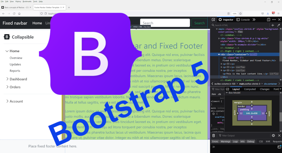
Bootstrap 5.1 Official Examples page provides a very good starting point. Cannibalising bits and pieces from Sticky Footer Navbar Template · Bootstrap v5.1 and Sidebars · Bootstrap v5.1, I was able to construct the layout that I want. Please click on image thumbnail to view in full size:

This is only the initial working version, so the codes are messy. I do apologise. I thought I would just post this, otherwise I will lose motivation later on. The HTML and CSS are posted below:
<!doctype html>
<html lang="en" class="h-100">
<head>
    <meta charset="utf-8">
    <meta name="viewport" content="width=device-width, initial-scale=1">
    <meta name="description" content="">
    <meta name="author" content="Mark Otto, Jacob Thornton, and Bootstrap contributors">
    <meta name="generator" content="Hugo 0.88.1">
    <title>Fixed Navbar Sidebar and Fixed Footer · Bootstrap v5.1</title>

    <!-- Bootstrap core CSS -->
    <link href="bootstrap-5.1.3-examples/assets/dist/css/bootstrap.min.css" rel="stylesheet">

    <style>
		.bd-placeholder-img {
			font-size: 1.125rem;
			text-anchor: middle;
			-webkit-user-select: none;
			-moz-user-select: none;
			user-select: none;
		}

		@media (min-width: 768px) {
			.bd-placeholder-img-lg {
				font-size: 3.5rem;
			}
		}
    </style>

    <!-- Custom styles for this template -->
    <link href="sidebars.css" rel="stylesheet">

	<style>
        header, footer {
			min-height: 60px;
		}

		main div.container {
			overflow-y: auto;
		}
	</style>
</head>

<body class="d-flex flex-column h-100">

	<svg xmlns="http://www.w3.org/2000/svg" style="display: none;">
		<symbol id="bootstrap" viewBox="0 0 118 94">
			<title>Bootstrap</title>
			<path fill-rule="evenodd" clip-rule="evenodd" d="M24.509 0c-6.733 0-11.715 5.893-11.492 12.284.214 6.14-.064 14.092-2.066 20.577C8.943 39.365 5.547 43.485 0 44.014v5.972c5.547.529 8.943 4.649 10.951 11.153 2.002 6.485 2.28 14.437 2.066 20.577C12.794 88.106 17.776 94 24.51 94H93.5c6.733 0 11.714-5.893 11.491-12.284-.214-6.14.064-14.092 2.066-20.577 2.009-6.504 5.396-10.624 10.943-11.153v-5.972c-5.547-.529-8.934-4.649-10.943-11.153-2.002-6.484-2.28-14.437-2.066-20.577C105.214 5.894 100.233 0 93.5 0H24.508zM80 57.863C80 66.663 73.436 72 62.543 72H44a2 2 0 01-2-2V24a2 2 0 012-2h18.437c9.083 0 15.044 4.92 15.044 12.474 0 5.302-4.01 10.049-9.119 10.88v.277C75.317 46.394 80 51.21 80 57.863zM60.521 28.34H49.948v14.934h8.905c6.884 0 10.68-2.772 10.68-7.727 0-4.643-3.264-7.207-9.012-7.207zM49.948 49.2v16.458H60.91c7.167 0 10.964-2.876 10.964-8.281 0-5.406-3.903-8.178-11.425-8.178H49.948z"></path>
		</symbol>
	</svg>

	<header>
		<nav class="navbar navbar-expand-md navbar-dark fixed-top bg-dark">
			<div class="container-fluid">
				<a class="navbar-brand" href="#">Fixed navbar</a>
				<button class="navbar-toggler" type="button" data-bs-toggle="collapse" data-bs-target="#navbarCollapse" aria-controls="navbarCollapse" aria-expanded="false" aria-label="Toggle navigation">
					<span class="navbar-toggler-icon"></span>
				</button>
				<div class="collapse navbar-collapse" id="navbarCollapse">
					<ul class="navbar-nav me-auto mb-2 mb-md-0">
						<li class="nav-item">
							<a class="nav-link active" aria-current="page" href="#">Home</a>
						</li>
						<li class="nav-item">
							<a class="nav-link" href="#">Link</a>
						</li>
						<li class="nav-item">
							<a class="nav-link disabled">Disabled</a>
						</li>
					</ul>

					<form class="d-flex">
						<input class="form-control me-2" type="search" placeholder="Search" aria-label="Search">
						<button class="btn btn-outline-success" type="submit">Search</button>
					</form>
				</div>
			</div>
		</nav>
	</header>

	<main style="background-color:yellow;">

	<!-- sidebar. --->
	<div class="flex-shrink-0 p-3 bg-white" style="width: 280px;">
		<a href="/" class="d-flex align-items-center pb-3 mb-3 link-dark text-decoration-none border-bottom">
			<svg class="bi me-2" width="30" height="24"><use xlink:href="#bootstrap"/></svg>
			<span class="fs-5 fw-semibold">Collapsible</span>
		</a>

		<ul class="list-unstyled ps-0">
			<li class="mb-1">
				<button class="btn btn-toggle align-items-center rounded collapsed" data-bs-toggle="collapse" data-bs-target="#home-collapse" aria-expanded="true">
					Home
				</button>
				<div class="collapse show" id="home-collapse">
					<ul class="btn-toggle-nav list-unstyled fw-normal pb-1 small">
						<li><a href="#" class="link-dark rounded">Overview</a></li>
						<li><a href="#" class="link-dark rounded">Updates</a></li>
						<li><a href="#" class="link-dark rounded">Reports</a></li>
					</ul>
				</div>
			</li>
			<li class="mb-1">
				<button class="btn btn-toggle align-items-center rounded collapsed" data-bs-toggle="collapse" data-bs-target="#dashboard-collapse" aria-expanded="false">
					Dashboard
				</button>
				<div class="collapse" id="dashboard-collapse">
					<ul class="btn-toggle-nav list-unstyled fw-normal pb-1 small">
						<li><a href="#" class="link-dark rounded">Overview</a></li>
						<li><a href="#" class="link-dark rounded">Weekly</a></li>
						<li><a href="#" class="link-dark rounded">Monthly</a></li>
						<li><a href="#" class="link-dark rounded">Annually</a></li>
					</ul>
				</div>
			</li>
			<li class="mb-1">
				<button class="btn btn-toggle align-items-center rounded collapsed" data-bs-toggle="collapse" data-bs-target="#orders-collapse" aria-expanded="false">
					Orders
				</button>
				<div class="collapse" id="orders-collapse">
					<ul class="btn-toggle-nav list-unstyled fw-normal pb-1 small">
						<li><a href="#" class="link-dark rounded">New</a></li>
						<li><a href="#" class="link-dark rounded">Processed</a></li>
						<li><a href="#" class="link-dark rounded">Shipped</a></li>
						<li><a href="#" class="link-dark rounded">Returned</a></li>
					</ul>
				</div>
			</li>
			<li class="border-top my-3"></li>
			<li class="mb-1">
				<button class="btn btn-toggle align-items-center rounded collapsed" data-bs-toggle="collapse" data-bs-target="#account-collapse" aria-expanded="false">
					Account
				</button>
				<div class="collapse" id="account-collapse">
					<ul class="btn-toggle-nav list-unstyled fw-normal pb-1 small">
						<li><a href="#" class="link-dark rounded">New...</a></li>
						<li><a href="#" class="link-dark rounded">Profile</a></li>
						<li><a href="#" class="link-dark rounded">Settings</a></li>
						<li><a href="#" class="link-dark rounded">Sign out</a></li>
					</ul>
				</div>
			</li>
		</ul>
	</div>

	<div class="b-example-divider"></div>
	<!-- Sidebar. -->

	<!-- Right ( right ) content. -->
	<div class="container">
		<h1 class="mt-5">Fixed Navbar, Sidebar and Fixed Footer</h1>

		<p>
			Lorem ipsum dolor sit amet, consectetur adipiscing elit. Quisque nisl eros, pulvinar facilisis justo mollis, auctor consequat urna. Morbi a bibendum metus. Donec scelerisque sollicitudin enim eu venenatis. Duis tincidunt laoreet ex, in pretium orci vestibulum eget. Class aptent taciti sociosqu ad litora torquent per conubia nostra, per inceptos himenaeos. Duis pharetra luctus lacus ut vestibulum. Maecenas ipsum lacus, lacinia quis posuere ut, pulvinar vitae dolor. Integer eu nibh at nisi ullamcorper sagittis id vel leo. Integer feugiat faucibus libero, at maximus nisl suscipit posuere. Morbi nec enim nunc. Phasellus bibendum turpis ut ipsum egestas, sed sollicitudin elit convallis. Cras pharetra mi tristique sapien vestibulum lobortis. Nam eget bibendum metus, non dictum mauris. Nulla at tellus sagittis, viverra est a, bibendum metus.
		</p>

		<p>This is the last content line.</p>
	</div>
	<!-- Right ( right ) content. -->
	</main>

	<footer class="footer mt-auto py-3 bg-light">
		<div class="container">
			<span class="text-muted">Place fixed footer content here.</span>
		</div>
	</footer>

    <script src="bootstrap-5.1.3-examples/assets/dist/js/bootstrap.bundle.min.js"></script>
</body>
</html>
The CSS file is essentially sidebars.css from Sidebars · Bootstrap v5.1 example; the only modification is the width of .b-example-divider changed to 0.2rem.
body {
  min-height: 100vh;
  min-height: -webkit-fill-available;
}

html {
  height: -webkit-fill-available;
}

main {
  display: flex;
  flex-wrap: nowrap;
  height: 100vh;
  height: -webkit-fill-available;
  max-height: 100vh;
  overflow-x: auto;
  overflow-y: hidden;
}

.b-example-divider {
  flex-shrink: 0;
  width: 0.2rem;
  height: 100vh;
  background-color: rgba(0, 0, 0, .1);
  border: solid rgba(0, 0, 0, .15);
  border-width: 1px 0;
  box-shadow: inset 0 .5em 1.5em rgba(0, 0, 0, .1), inset 0 .125em .5em rgba(0, 0, 0, .15);
}

.bi {
  vertical-align: -.125em;
  pointer-events: none;
  fill: currentColor;
}

.dropdown-toggle { outline: 0; }

.nav-flush .nav-link {
  border-radius: 0;
}

.btn-toggle {
  display: inline-flex;
  align-items: center;
  padding: .25rem .5rem;
  font-weight: 600;
  color: rgba(0, 0, 0, .65);
  background-color: transparent;
  border: 0;
}
.btn-toggle:hover,
.btn-toggle:focus {
  color: rgba(0, 0, 0, .85);
  background-color: #d2f4ea;
}

.btn-toggle::before {
  width: 1.25em;
  line-height: 0;
  content: url("data:image/svg+xml,%3csvg xmlns='http://www.w3.org/2000/svg' width='16' height='16' viewBox='0 0 16 16'%3e%3cpath fill='none' stroke='rgba%280,0,0,.5%29' stroke-linecap='round' stroke-linejoin='round' stroke-width='2' d='M5 14l6-6-6-6'/%3e%3c/svg%3e");
  transition: transform .35s ease;
  transform-origin: .5em 50%;
}

.btn-toggle[aria-expanded="true"] {
  color: rgba(0, 0, 0, .85);
}
.btn-toggle[aria-expanded="true"]::before {
  transform: rotate(90deg);
}

.btn-toggle-nav a {
  display: inline-flex;
  padding: .1875rem .5rem;
  margin-top: .125rem;
  margin-left: 1.25rem;
  text-decoration: none;
}
.btn-toggle-nav a:hover,
.btn-toggle-nav a:focus {
  background-color: #d2f4ea;
}

.scrollarea {
  overflow-y: auto;
}

.fw-semibold { font-weight: 600; }
.lh-tight { line-height: 1.25; }
I started off using the index.html file from Sticky Footer Navbar Template · Bootstrap v5.1 example. All CSS declared in the <header/> section retained. The two CSS classes d-flex and flex-column on the <body> tag indicates that it is using flex box layout.
This document https://developer.mozilla.org/en-US/docs/Web/CSS/CSS_Flexible_Box_Layout/Basic_Concepts_of_Flexbox is a good introduction to flex box layout.
Bootstrap defines no default heights for <header> and <footer>. And so content of <main> goes behind both <header> and <footer>. In the HTML file, I define a default min-height for both:
	<style>
        header, footer {
			min-height: 60px;
		}
	</style>
<main> should grow and shrink according to the vertical space availabilty. So class flex-shrink-0 is removed from <main>. Finally, the working area is scrollable:
	<style>
		main div.container {
			overflow-y: auto;
		}
	</style>
The sidebar will not have a vertical scrollbar, this is not a bug. This code will need clean up significantly: it is only my initial working cut. Thank you for visiting. I hope you find this useful somehow.
Added 26/04/2022
A real-life working variation of this layout is this page: https://behai-nguyen.github.io/jquery-bhdropdownselect/. It is a bit simpler: it does not have the navigation menu area on the left.
This is the repo for the above page: https://github.com/behai-nguyen/behai-nguyen.github.io. The relevant directories are:
- _layouts: https://github.com/behai-nguyen/behai-nguyen.github.io/tree/main/_layouts
- _includes: https://github.com/behai-nguyen/behai-nguyen.github.io/tree/main/_includes
 Be Hai Nguyen