
We do some AJAX requests, they result in errors, and we need to display those error messages to users. In previous projects, we use dynamic jQuery dialogs to do this. I’ve now re-created similar dialog using Bootstrap 5.1.3; and jQuery 3.6.0 script library. For official information on Bootstrap modal dialog, please take a look at this page: https://getbootstrap.com/docs/5.0/components/modal/; please pay attention to the event section: https://getbootstrap.com/docs/5.0/components/modal/#getorcreateinstance.
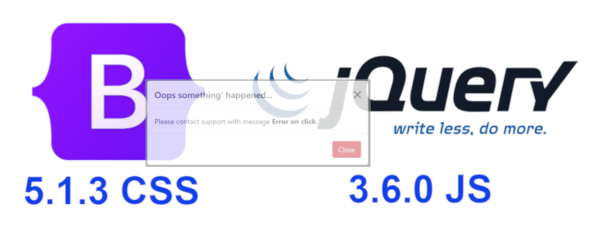
The following screen captures show the dialogs in action. They are standard Bootstrap 5.1.3 modal dialog. I’ve not done any customisations, nor new CSS. The dialog HTML comes from https://getbootstrap.com/docs/5.0/components/modal/:


I’ve implemented the on demand dialog as a JavaScript closure. This is a ready to use JavaScript code:
File popupdialog.js
/*
    Description:

        A generic dynamic Bootstrap 5.0 popup dialog.

        The dialog HTML is created dynamically and gets removed
		after finished closing.

    Arguments:

        title:
            Dialog title.

        message:
            Actual message text to be displayed inside dialog body.

            This is HTML: text must be wrapped inside a HTML tag, e.g.:

			    <span>Please contact <strong>Support</strong>...</span>

        buttonClass:
            Bootstrap CSS class names, such as 'btn-danger', 'btn-warning'.
			Default is 'btn-danger'.
*/
function genericDialog( title, message, buttonClass='') {
	var dialogHTML =
		'<div class="modal fade" id="popupDialog" tabindex="-1" aria-labelledby="popupDialogLabel" aria-hidden="true">' +
		  '<div class="modal-dialog modal-dialog-centered">' +
			'<div class="modal-content">' +
			  '<div class="modal-header">' +
				'<h5 class="modal-title" id="popupDialogLabel">Title</h5>' +
				'<button type="button" class="btn-close" data-bs-dismiss="modal" aria-label="Close"></button>' +
			  '</div>' +
			  '<div class="modal-body">' +
				'This is a test modal.' +
			  '</div>' +
			  '<div class="modal-footer">' +
				'<button type="button" class="btn btn-danger" data-bs-dismiss="modal">Close</button>' +
			  '</div>' +
			'</div>' +
		  '</div>' +
		'</div>';

	function initialise() {
		// Should not exist, but just in case.
		$( '#popupDialog' ).remove();

		$( 'body' ).append( $(dialogHTML) );

		var dialog = $( '#popupDialog' );

		$( '.modal-title', dialog ).text( title );
		$( '.modal-body', dialog ).empty().html( $(message) );

		if ( buttonClass.length > 0 )
		    $( 'button', dialog ).removeClass().addClass( 'btn ' + buttonClass );

		// Fired when dialog is completely hidden. Remove dialog from the DOM.
		dialog.on( 'hidden.bs.modal', ( event ) => $( '#popupDialog' ).remove() );
	};

	function doOpen() {
		var modal = new bootstrap.Modal( '#popupDialog' );
		modal.show();
	};

	function open() {
		initialise();
		doOpen();
	};

	return open;
};

function displayError( xhr, error, errorThrown ) {
	var html = `<span>Please contact support with message <strong>${errorThrown}</strong>.</span>`;
	genericDialog( 'Oops something\' happened...', html )();
};

function displayWarning( xhr, error, errorThrown ) {
	var html = `<span>Please contact support with message <strong>${errorThrown}</strong>.</span>`;
	genericDialog( 'Oops something\' happened...', html, 'btn-warning' )();
};

function displayInfo( msg ) {
	var html = `<span>msg</span>`;
	genericDialog( 'For your info', html, 'btn-info' )();
};
The code is very simple. Please note that, every time the closure is called, the actual HTML for the dialog is created in the DOM, when the dialog’s finished closing, its HTML gets removed from the DOM. Following is the HTML test page:
<!doctype html>
<html lang="en">
<head>
    <title>Test HTML</title>
    <meta http-equiv="Content-Type" content="text/html; charset=utf-8"/>

	<link href="https://cdn.jsdelivr.net/npm/bootstrap@5.1.3/dist/css/bootstrap.min.css" rel="stylesheet" integrity="sha384-1BmE4kWBq78iYhFldvKuhfTAU6auU8tT94WrHftjDbrCEXSU1oBoqyl2QvZ6jIW3" crossorigin="anonymous">
    <script src="https://code.jquery.com/jquery-3.6.0.min.js" integrity="sha256-/xUj+3OJU5yExlq6GSYGSHk7tPXikynS7ogEvDej/m4=" crossorigin="anonymous"></script>
	<script src="https://cdn.jsdelivr.net/npm/bootstrap@5.1.3/dist/js/bootstrap.bundle.min.js" integrity="sha384-ka7Sk0Gln4gmtz2MlQnikT1wXgYsOg+OMhuP+IlRH9sENBO0LRn5q+8nbTov4+1p" crossorigin="anonymous"></script>

    <script src="popupdialog.js"></script>

    <script>
        $( document ).ready( () => {
		    $( '#openDlgBtn' ).on( 'click', (event) => displayError( null, null, 'Error on click' ) );

		    displayWarning( null, null, 'Warning on start up' );
        });
    </script>
</head>

<body>
	<button type="button" class="btn btn-primary" id="openDlgBtn">
	  Launch demo modal
	</button>
</body>
</html>
In the above HTML please note the line:
<script src="popupdialog.js"></script>
The HTML should work as is in your localhost. Please take a look at the JavaScript in the HTML page:
$( document ).ready( () => {
	$( '#openDlgBtn' ).on( 'click', (event) => displayError( null, null, 'Error on click' ) );

	displayWarning( null, null, 'Warning on start up' );
});
The call to displayWarning( … ) demonstrates the dialog main usage: popup on demand. Please also note that, I don’t call the closure directly, but rather the methods that use it.. This is my first cut of the dialog. I’m sure it’s going to change in the future. The content of the dialog can be made as rich as Bootstrap 5.1.3 would allow: and this can be done outside of the closure.
I hope you find this a tiny bit useful. And thank you for visiting. Stay safe and take care.
 Be Hai Nguyen